Pantone Colour Trends: Peach Fuzz, the Colour of the Year System and the 2026 Palette
The 2026 Palette Pairs Soft Neutrals With Clear Brights
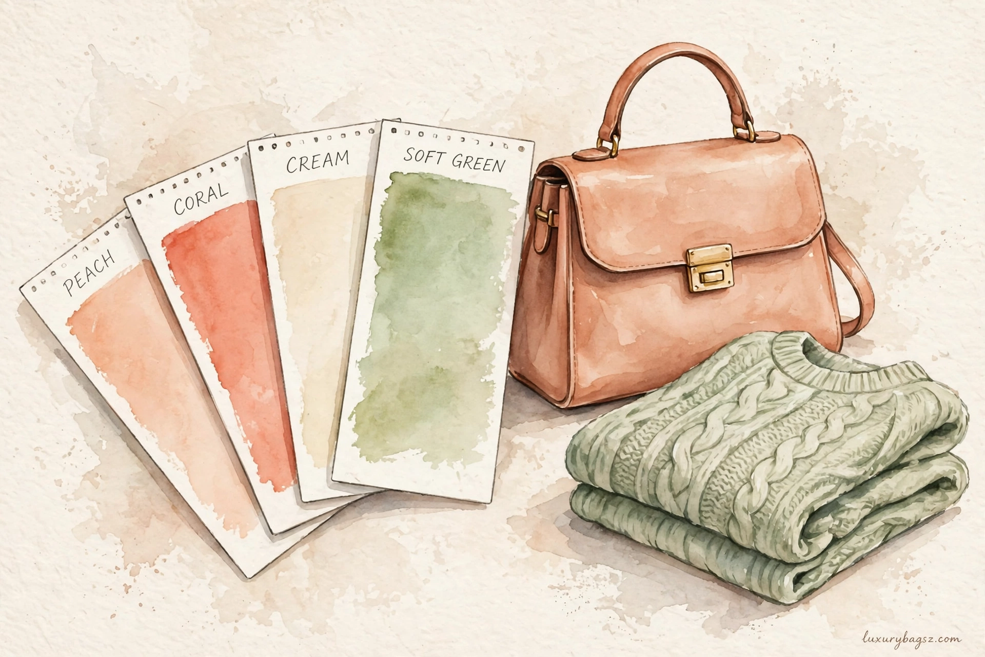
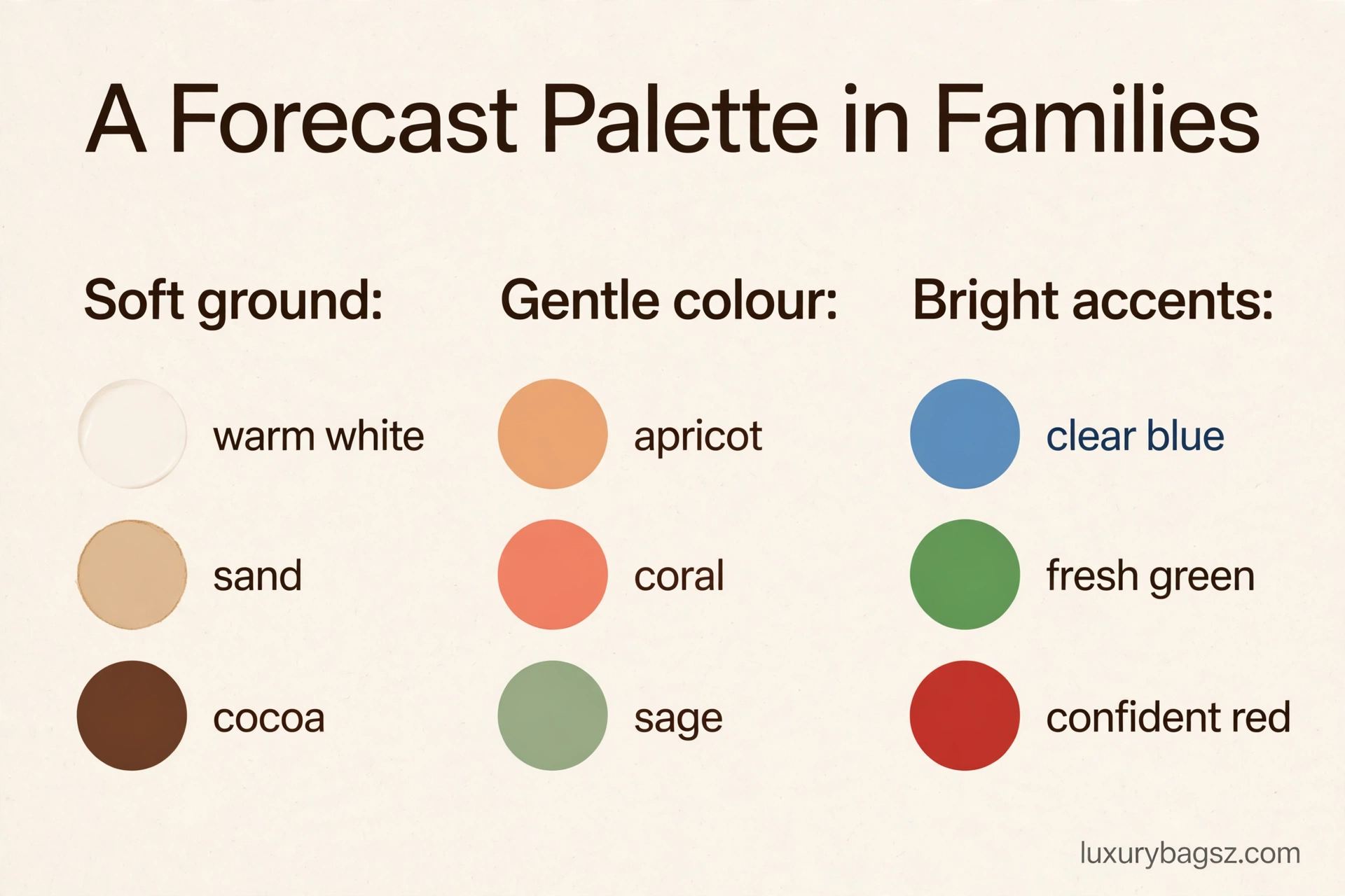
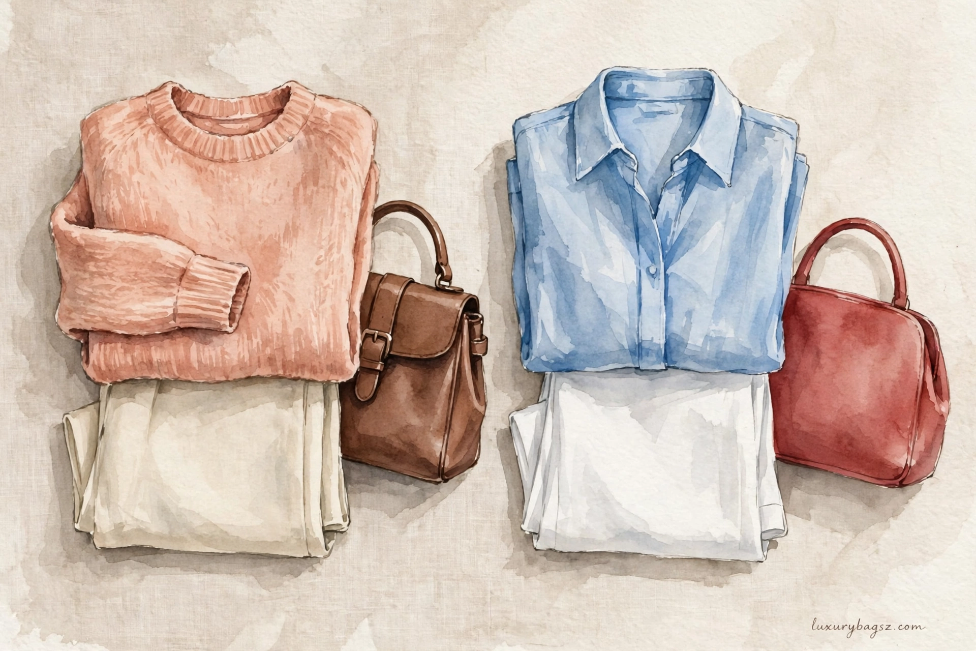
For 2026, the direction is a calm base lifted by brighter accents. Warm whites, gentle greys, sand and cocoa provide the wearable ground, while apricot and coral carry forward the peach family, alongside fresh greens, clear blues and a confident red-toned shade for evening. The mix is meant for combining, not for wearing one colour head to toe.
That balance follows the wider Pantone pattern, where Peach Fuzz for 2024 showed how a soft, warm shade could shape fashion, beauty and interiors. Keep coats, tailoring and your best bag in the neutral ground, and bring in the brighter tones through bags, scarves, knitwear and makeup.
One Colour System to Rule the Season: Pantone in Brief
Pantone colour trends start with a forecasting system, not a runway: the Pantone Color Institute studies culture, film, art, travel and industry, then names a Colour of the Year and seasonal palettes that brands across fashion, beauty and interiors build products around. Peach Fuzz, the soft peach chosen for 2024, showed how the system works — a gentle, nurturing shade that appeared on runways, in makeup and on handbags within months. Read the forecast as a mood briefing, then buy only the shades that flatter you.
Key Takeaways
- Pantone is a colour standard and forecasting business, not a fashion house.
- The Colour of the Year is chosen to capture a cultural mood, then licensed widely.
- Peach Fuzz (2024) stood for warmth, care and softness after hard years.
- Seasonal palettes group colours into families, which is how to shop them.
- The 2026 direction keeps soft neutrals beside clear, optimistic brights.
- Wear forecast colour cheapest through bags, scarves, knitwear and makeup.
What Pantone Is, and Why Fashion Listens
Pantone began as a colour-matching standard: numbered swatches that let a printer, a mill and a brand in three countries produce the exact same shade. That numbering system is why a forecast colour can be manufactured identically everywhere. The Color Institute layered forecasting on top of the standard. Its team tracks exhibitions, films in production, sporting events, new technology and street culture, looking for colours that keep recurring as a mood. Because so many industries license the same palettes, a Pantone announcement becomes self-fulfilling: once homeware, phones, makeup and fashion all launch the shade, the colour genuinely is everywhere that year.
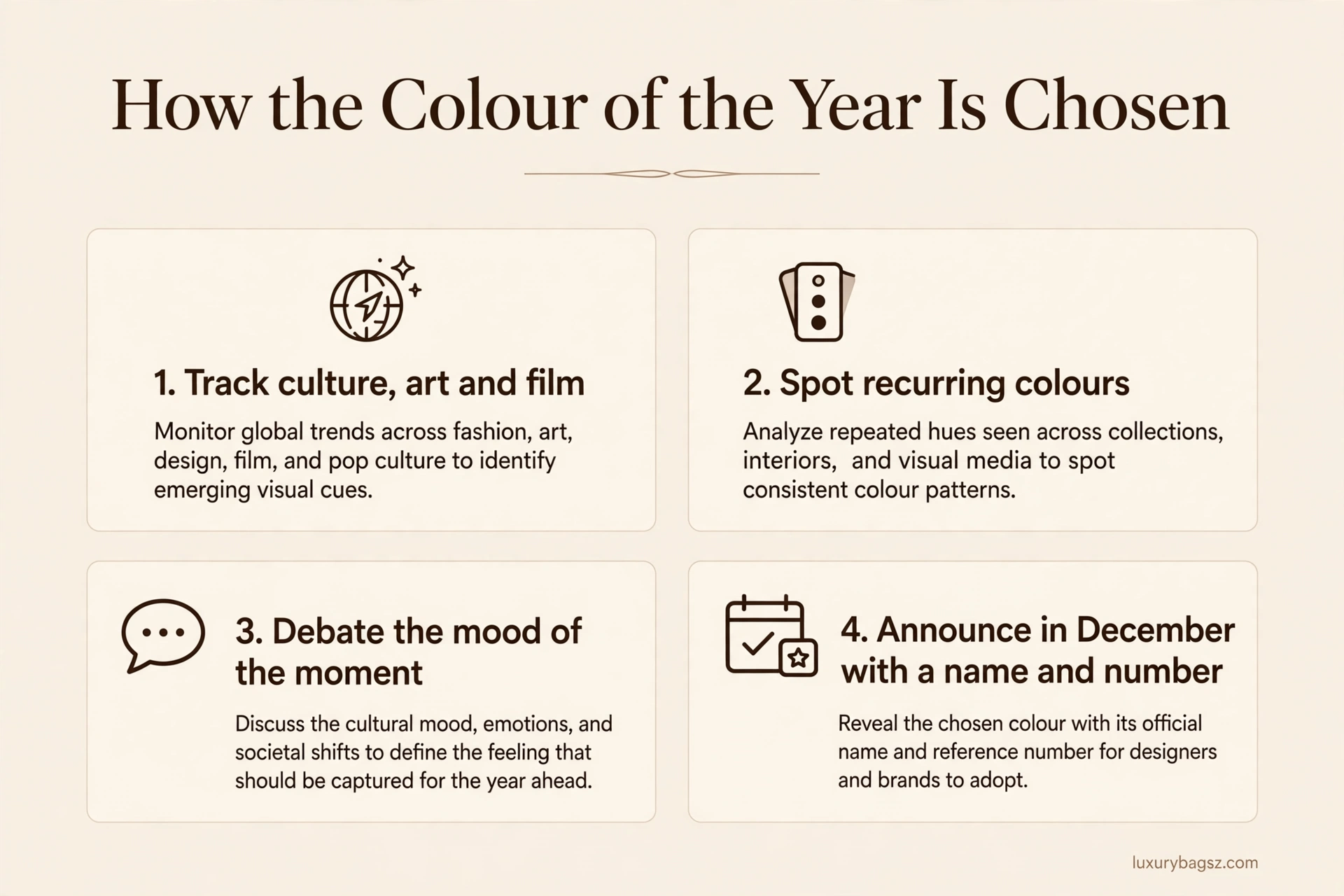
How the Colour of the Year Is Chosen
The choice is announced each December after a year of research and debate inside the institute. The panel weighs what the world seems to need emotionally as much as what looks new. The winning shade gets a number, a name and a story. Peach Fuzz is PANTONE 13-1023; the name does half the work, because a shade called fuzz invites touch in a way a number never could. Critics note the commercial engine — licensing deals and product collaborations launch alongside the announcement. Both readings are true: it is a sincere mood judgement and a very effective piece of marketing.
Peach Fuzz: Anatomy of a Hit Colour
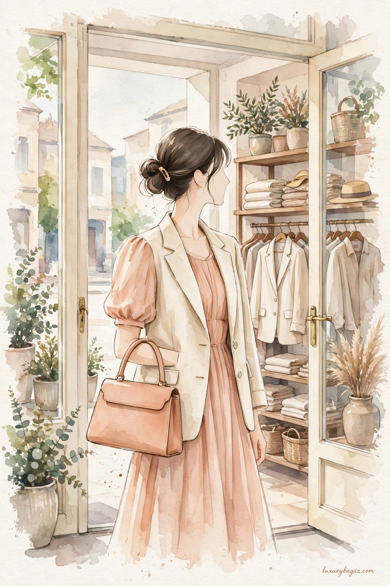
Peach Fuzz is a velvety peach sitting between pink and orange, light in tone and warm in character. Pantone framed it as compassion and closeness: a colour that feels like an embrace rather than a shout. Fashion took it up in chiffon, knitwear and satin, and in leather goods where the shade reads almost as a neutral. On skin it flatters warm undertones and softens black tailoring beautifully. Its success also proved the system's range: after several vivid or moody winners, a near-pastel could still dominate a year, because the mood it named — gentleness — was the story people wanted to wear.

The Colours That Came Before and After
Each winner dates its year like a song. Very Peri's blue-violet spoke of digital invention, Viva Magenta of exuberant defiance, and the softer choice that followed Peach Fuzz continued the turn towards calm. Reading the sequence teaches the real lesson: the institute alternates energy and rest. A loud year is usually followed by a soothing one, which helps shoppers predict whether next season's rails will shout or whisper. For wardrobes, the archive matters practically. A bag bought in a past Colour of the Year does not expire; it becomes a dated-in-a-good-way piece that stylists revive whenever its family rotates back.
The 2026 Palette: Soft Ground, Bright Accents
The 2026 direction emerging from Pantone's seasonal fashion reporting keeps the pattern: a ground of soft, wearable neutrals — warm whites, gentle greys, sand and cocoa tones — lifted by clearer brights used as accents. Expect peach's family to persist in apricot and coral forms, beside fresh greens, clear blues and one confident red-family shade for evening. The palette is built for mixing rather than head-to-toe colour. Leather goods show the palette early, because bags are dyed in forecast shades a season ahead. Our Hermès colours guide decodes how one house names and grades its colour families, a useful contrast to Pantone's universal numbering.
Wearing Forecast Colour Without Waste
Start with the family, not the exact swatch. If the forecast says peach, the apricot knit you already own is on-trend; nobody at street level is checking numbers against a fan deck. Accessories are the low-risk entry: a bag, scarf or pair of shoes in the year's shade updates black, navy and cream clothes instantly. The story of the baby blue Prada bag shows how one forecast-friendly colour can carry a whole collection piece. Keep investment pieces — coats, tailoring, your best bag — in the palette's neutral ground, and let tops, knits and makeup carry the year's brights. When the forecast turns, only the cheap layer needs to change.
Pairings That Make Forecast Shades Work
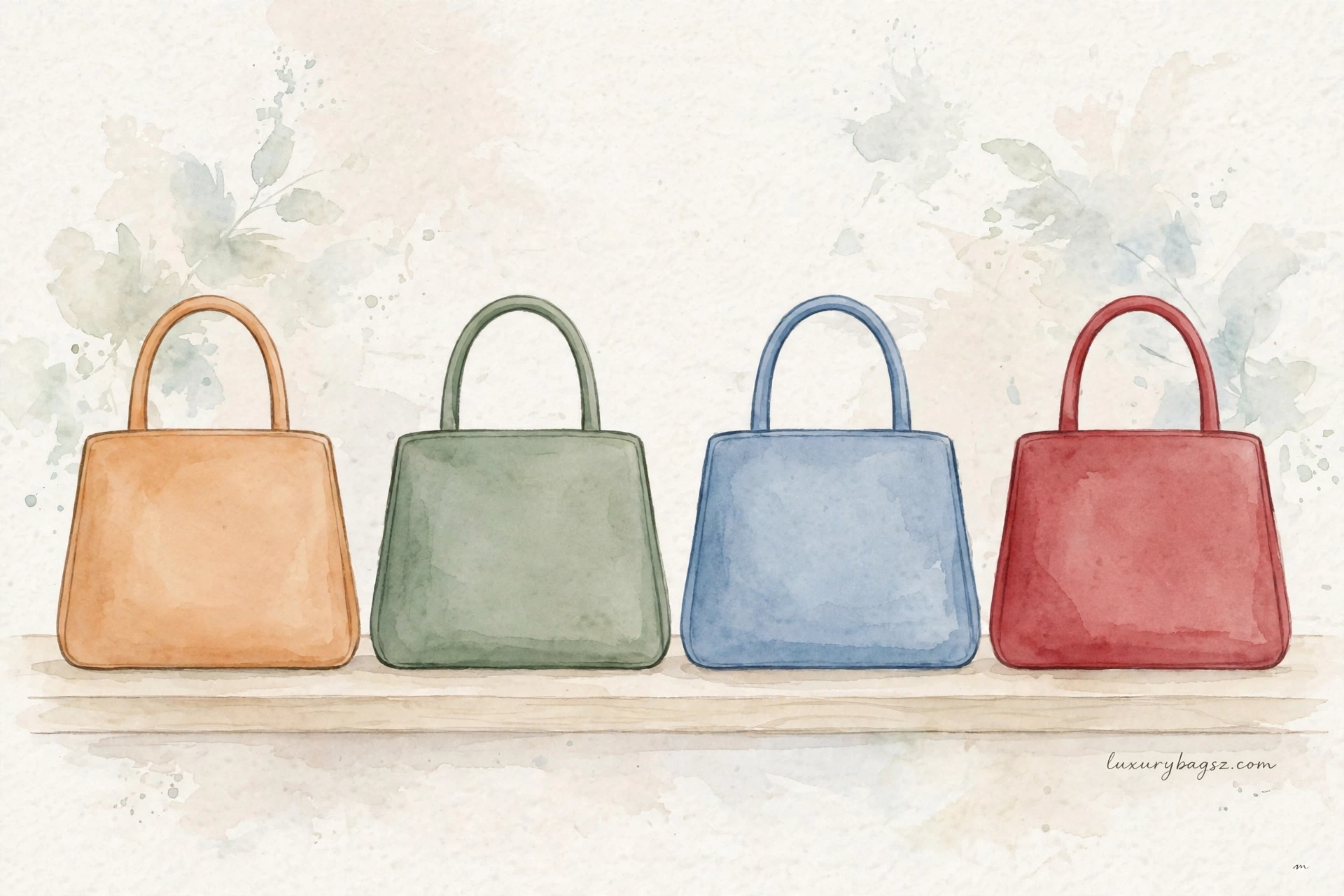
Peach and its apricot cousins pair best with cream, cocoa, soft gold and sage. Against pure white they can look washed out; against warm neutrals they glow. Clear blues and greens in the 2026 palette love white and pale grey, while the red-family accent shade wants black, deep navy or chocolate to look expensive rather than loud. For cold months, our edit of winter white bags demonstrates the neutral-ground principle: a warm white bag lifts every forecast colour without competing with any of them.
What Pantone Cannot Tell You
A forecast cannot tell you whether a colour suits your skin, your climate or your life. A shade that sings in a sunlit campaign may look tired under northern office light. It also cannot pace your spending. Brands will launch the colour at every price in the same month, and the temptation is to buy the trend five times. Once is expression; five times is a uniform you will resent. Use the announcement as a free styling service instead: it hands you new pairings and permission to revive old pieces in the same family. That is the forecast's real value to a wardrobe.
Frequently Asked Questions
Who chooses the Pantone Colour of the Year?
A panel at the Pantone Color Institute, after a year spent tracking culture, art, film, travel, technology and street style. The choice is announced each December with a name, a number and a mood story.
What exactly is Peach Fuzz?
Peach Fuzz is PANTONE 13-1023, the Colour of the Year for 2024: a soft, warm peach between pink and orange. It was framed as a nurturing, gentle shade and appeared widely in fashion, beauty and interiors.
Do designers have to follow Pantone trends?
No. Pantone sells standards and forecasts; houses use them voluntarily because shared palettes help manufacturing and retail. Many designers set their own colours, which Pantone's researchers then track as signals.
Are the 2026 colours very different from 2024's?
The direction is evolution, not reversal: soft warm neutrals remain the ground, peach's family continues in apricot and coral, and clearer brights — greens, blues and a confident red — arrive as accents.
How can I wear a forecast colour cheaply?
Through the small layer: a scarf, a knit, nail colour, makeup or a pre-owned bag in the shade. Keep coats and best bags in neutral colours so only inexpensive pieces date with the forecast.
Does a Colour of the Year bag hold value?
Colour-of-the-year shades in classic bag shapes tend to revive cyclically, but value still rests on the house, model and condition first. Buy the shade because you love it, not as a colour-based investment.
Why do so many products launch in the same shade at once?
Because the colour is licensed and manufactured to a shared number. Brands plan collaborations around the announcement, so fashion, phones, makeup and homeware can all release the identical shade in one season.
Can I wear last year's colour?
Absolutely. Forecast colours fade from headlines, not from wardrobes. A past winner worn confidently, especially in a good leather or knit, reads as personal style rather than old news within a year or two.
Which forecast shades suit cool skin tones?
Within any palette, choose the blue-based members: clear blues, cool pinks, true reds and soft greys. Warm peaches and corals sit better on warm undertones, or work for cool skin kept away from the face, on bags and shoes.
Where can I see the seasonal palettes?
Pantone publishes fashion colour trend reports for the main fashion weeks, and magazines summarise them each season. Retail edits in the following months show which palette colours shops actually bought.
Conclusion: A Forecast Is a Mood, Not a Shopping List
Pantone's system turns a cultural mood into a numbered shade the whole world can manufacture, and Peach Fuzz proved a soft colour can still own a year. Enjoy the 2026 palette the same way: take its soft neutral ground for the pieces you keep, borrow its brights for the pieces you rotate, and let the forecast refresh your wardrobe rather than replace it.